Branding for independent and small businesses: a practical guide to getting started

“Branding can feel distant from the day to day reality of running an independent business. In practice it is simple.”
Branding is the way your business looks, sounds and behaves wherever people meet it. For trades, shops, cafés, studios and consultancies, that usually means vans, shopfronts, websites, social media and the everyday documents you send to clients.
This guide is about the practical side of branding for independent and small businesses. What it includes, where it shows up, and how to start improving it step by step without needing a huge budget or a complicated strategy.
If you would like to understand the deeper reasons behind why branding matters at all, you can also read our article “Why branding matters for small businesses”.

What branding actually covers
Branding is more than a logo. For most independent and small businesses it includes:
Your name and logo
The colours and typefaces you use
The tone of voice in your writing
The style of your photos and graphics
How all of that appears on real touchpoints
When these things are consistent, customers get a clear sense of who you are. When they are mixed or random, the business feels less reliable, even if the work itself is good.
You do not need a thick brand book. You do need a simple, repeatable set of rules you can stick to.
First steps to get started
Step 1: Get clear on the basics
Before you change any visuals, answer a few simple questions in plain language:
What do you actually do
Who do you do it for
What do you want to be known for
What do your best clients value most about you
Write the answers down in a short paragraph or a few bullet points. This becomes your reference point. It will guide later decisions about your logo, messaging and what to show on your website and materials.
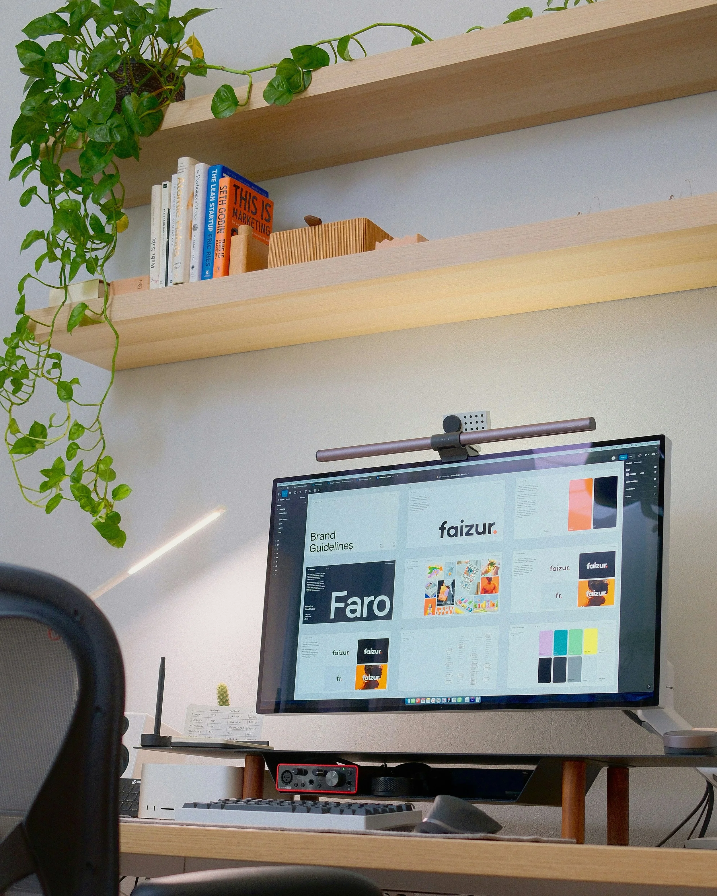
Step 2: Build a simple visual identity
A visual identity is the set of elements that make your business recognisable at a glance.
For an independent or small business, keep it lean:
Logo
You need one primary logo that works in most situations and a smaller mark or icon for tight spaces like social profiles or labels. The logo should be simple enough to work on screen, in print and on a van or sign.
Colour palette
Choose a primary colour and one or two supporting colours. Use them consistently on your website, vehicles, signage and print. Repetition is what builds recognition, not the number of colours.
Typography
Pick one typeface for headings and one for body text. Use them everywhere you can. This gives your materials a familiar rhythm. Avoid swapping fonts regularly to “freshen things up”. Consistency is more valuable.
Imagery
Decide on a basic rule for images. For example, “real photos of our work and spaces” or “simple product shots on neutral backgrounds”. Follow that rule instead of mixing styles from different sources.
Once these four pieces are decided, future design decisions become easier. You are choosing from a system rather than starting over each time.
Step 3: Decide how you want to sound
Tone of voice is how your business sounds whenever it uses words.
Ask yourself:
Do you want to sound informal and straightforward, or more formal and technical
Do you lean more toward short, direct sentences or more detailed explanations
Are there words and phrases that feel like you, and others that do not
Write a short note for yourself such as:
“Plain English, no jargon”
“Friendly but not silly”
“Explain the process calmly and step by step”
Use this as a guide when you write your website copy, social posts, emails and printed materials. Over time, people start to recognise your voice as much as your visuals.
Step 4: Apply your brand to the touchpoints that matter most
Once you have a basic visual identity and tone, focus on the places that clients see most often. These will vary by business type, but common high impact areas are:
Vans and vehicles
Shopfronts and window graphics
Website homepage and key pages
Social media profiles and main post templates
Quotes, invoices and proposals
Menus, flyers, brochures and posters
Email signatures
Pick the top three for your business and make them consistent first. For a trade or service business that might be your van, website and quote template. For a café or shop it might be your signage, menus and Instagram.
Aim for the same logo, colours, typefaces and tone of voice across all three. The goal is for a customer to move from one touchpoint to another and feel that they are dealing with the same business each time.

Common branding mistakes
Branding often drifts over time. Common issues for independent and small businesses include:
Several different logos or logo versions in circulation
Using different colours and fonts on every new piece of material
Mixing clip art, random stock images and styles with no clear pattern
A website that feels unrelated to the physical business
Quotes and invoices that look messy or generic
You do not need to fix everything at once. Start by deciding which logo, colours and fonts you want to keep, and remove the rest. Then slowly update your most important materials to use the chosen set.
What you can do yourself, and when to ask for help
Many independent and small businesses can improve their branding with self led steps:
Clarify who you are and who you serve
Choose a simple colour and type system
Clean up obvious inconsistencies
Update a few key touchpoints
You might want professional help when:
The gap between the quality of your work and how your business looks feels too wide
You are hesitant to show people your website or materials
You are competing with businesses that look far more polished
You want a brand identity that can work across lots of different applications without guessing
A brand identity project at that point is less about “making things pretty” and more about building a practical system that supports everything else you do.

How we support branding for independent and small businesses
We have over a decade of experience working with independent businesses and smaller teams across Canada, USA and Europe, that care about what they do and want their brand to reflect that. That includes trades, local shops, cafés, consultancies and small studios.
Branding projects can include:
Logo and wider visual identity
Simple, usable brand guidelines
Applications such as vehicles, signage, documents and social templates
Support with copy and messaging where you need it
The aim is to give you a brand that feels like you, helps you stand out for the right reasons, and is straightforward to use in everyday work.
Key takeaways
Branding is not just a logo. It is the way your business looks, sounds and behaves wherever people meet it.
Independent and small businesses benefit most from a simple, consistent system, not a complicated brand book.
A clear visual identity is built from four basics: logo, colours, typefaces and imagery used in a consistent way.
Tone of voice matters as much as visuals. Decide how you want to sound and apply it across your website, emails and social channels.
Focus first on the three or four touchpoints that matter most for your business, such as your van, shopfront, website or quotes.
Fixing common issues like multiple logos, mixed colours and messy documents can quickly lift how professional you appear.
Do what you can yourself, then bring in professional support when the gap between your work and your brand feels too wide.
If any of this has you thinking about your own business or where to take things next, feel free to get in touch.
Visit our contact page, book an intro call, or fill out the enquiry form and we will reach out shortly.
Email: hello.homerun.co@gmail.com