Sproutt
[Skilled Trade] (IDENTITY) (logo) (physical design)Making gardens feel alive again
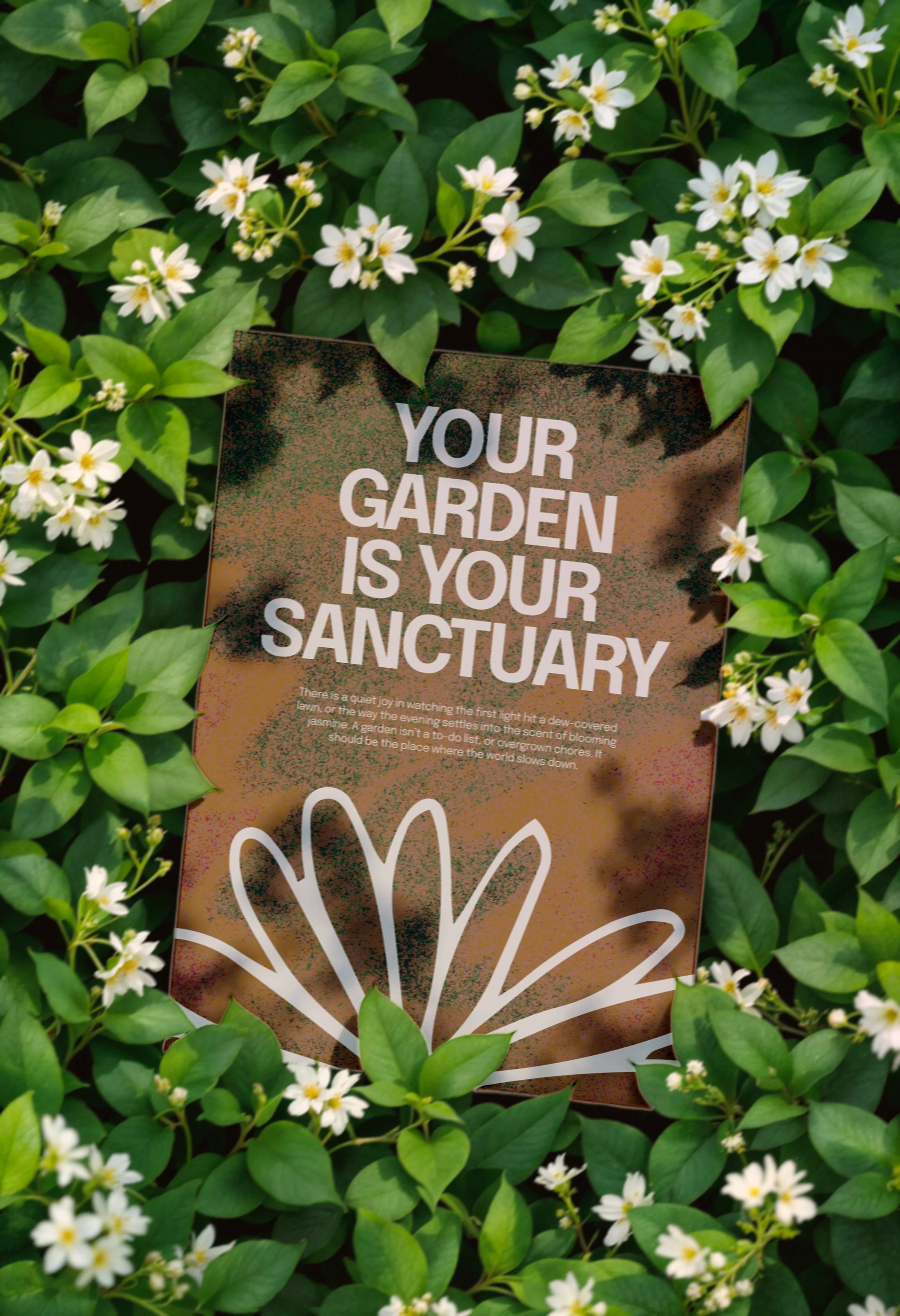
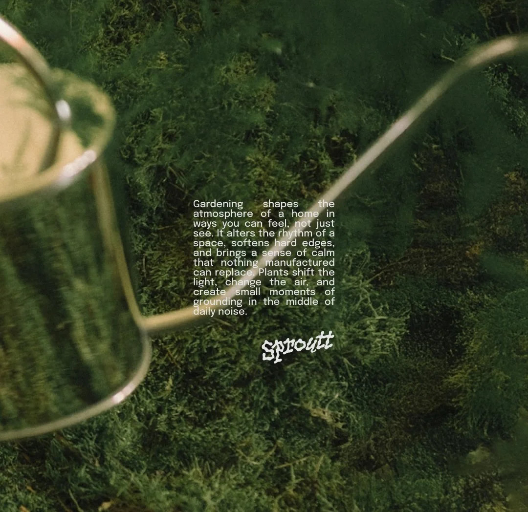
Sproutt came with a brief that already knew what it wasn't. No astro turf, no plastic plants, none of the sanitised outdoor spaces that have made modern gardening feel more like interior design than the outdoors. The founder had a clear conviction: that gardens should feel alive, with wild flowers, natural growth, and ecosystems that actually function. The challenge was building a brand around that point of view that felt genuinely fresh without losing the warmth of what gardening is actually about.
Challenging the category
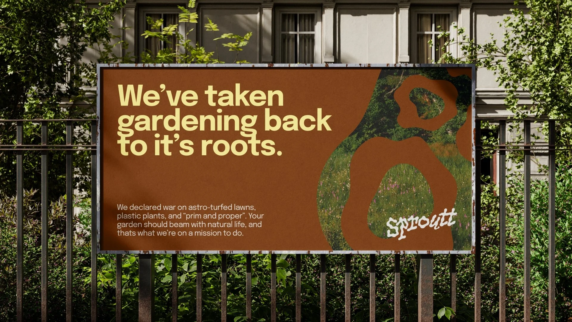
The gardening industry defaults to the same visual playbook: muted greens, soft script fonts, stock imagery of manicured lawns. Safe, predictable, and largely indistinguishable from one business to the next. We pushed deliberately against that. Bold typography where the category uses delicate lettering. A palette rooted in earth and texture rather than the expected garden greens. A brand voice with a clear opinion rather than the gentle, passive tone most gardening businesses settle for. The result is a brand that stands apart from everything around it in the market, not by being louder, but by being more considered.
Built to attract the right people
Sproutt isn't for everyone, and that's the point. By committing to a clear point of view and an identity to match, Sproutt has a platform that attracts exactly the right clients and gives them a very clear reason to choose it over anyone else. Sometimes the best briefs are the ones that already know what they're not.